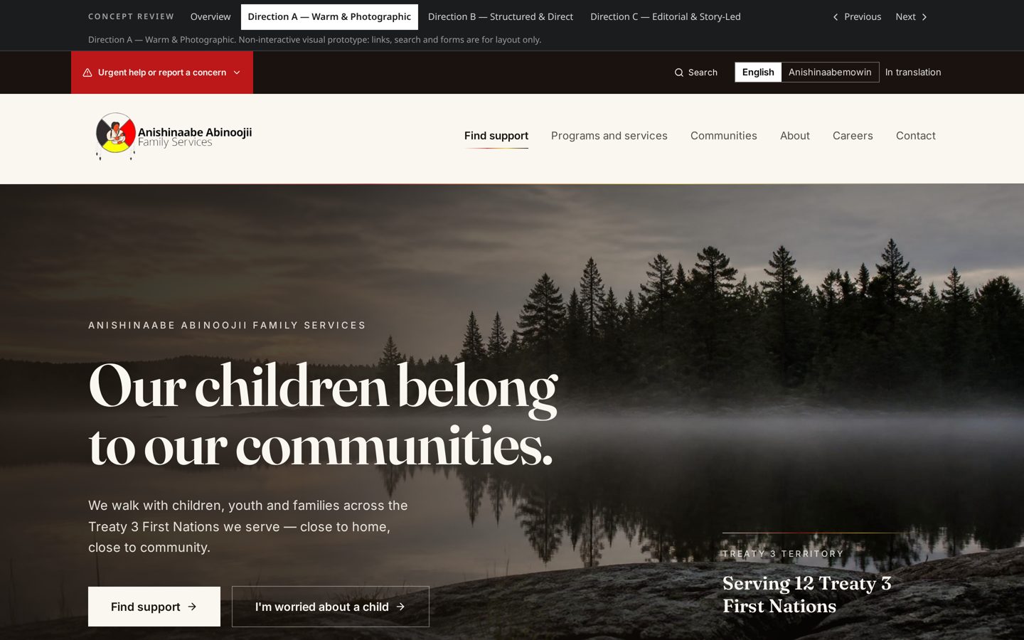
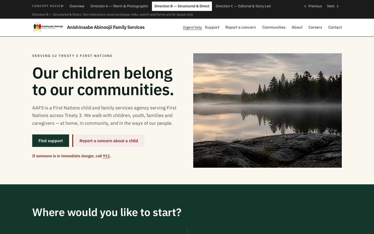
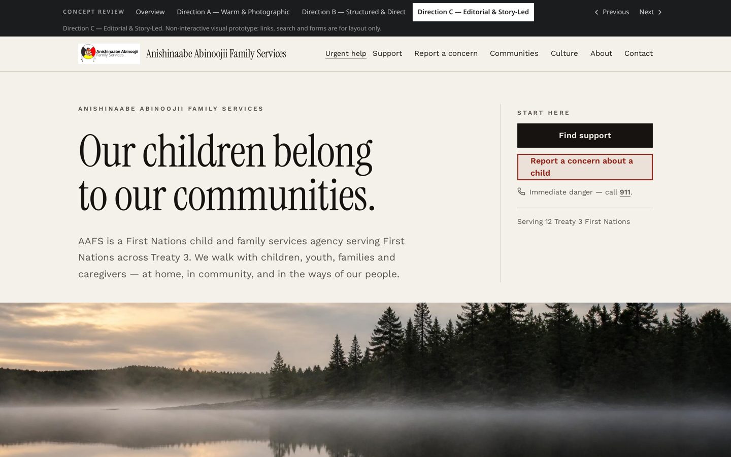
Before developing these design options we reviewed comparable Indigenous child and family service websites, broader public-service examples, and specialist sites that handle urgent help, community information, language, careers and service discovery particularly well.
No single website offered a complete model for AAFS. The strongest approach is to combine the best working patterns from several organizations while improving on the gaps that appeared repeatedly.
- Urgent help that is always visible
- Dilico Anishinabek Family Care and Kunuwanimano Child and Family Services make urgent child-safety information highly visible. This informed the persistent urgent-help treatment used throughout the concepts.
- Clearer reporting and support pathways
- Vancouver Aboriginal Child and Family Services Society and Native Child and Family Services of Toronto distinguish between immediate danger, child-safety reporting, after-hours service and general support. Those situations should not be collapsed into one vague Contact Us pathway.
- Supportive, nonjudgmental language
- Dnaagdawenmag Binnoojiiyag uses encouraging language that helps normalize reaching out for support. The site should feel welcoming to families seeking help, not only authoritative when reporting a concern.
- Communities as part of the service experience
- Weechi-it-te-win Family Services places its partner First Nations at the centre of its public presence. Community information should connect people with actual services, offices, workers and contact information.
- Finding services by location and need
- First Nations Health Authority shows how location and service needs can work together. The opportunity for AAFS is to provide that clarity without recreating an overly large directory.
- A more complete careers experience
- Native Child and Family Services of Toronto explains workplace culture, benefits, accessibility and the hiring experience before sending visitors to job postings. That is stronger than treating careers as a set of downloadable PDFs.
- Simple, task-based navigation
- Canada.ca and GOV.UK show the value of organizing information around what a visitor needs to do. This is why each concept begins with situations rather than program names.
A searchable list is faster, more accessible, easier to use on a phone and easier to keep accurate. It also avoids displaying geographic boundaries that have not been confirmed. An interactive map can be added later if it supports a validated user need and uses approved geographic information. The current approach is a deliberate starting point, not an unfinished version of the experience.